Dashboard and Widget Elements
Overview
In Fusion, Dashboards are container-like objects embedded with one or more widgets.
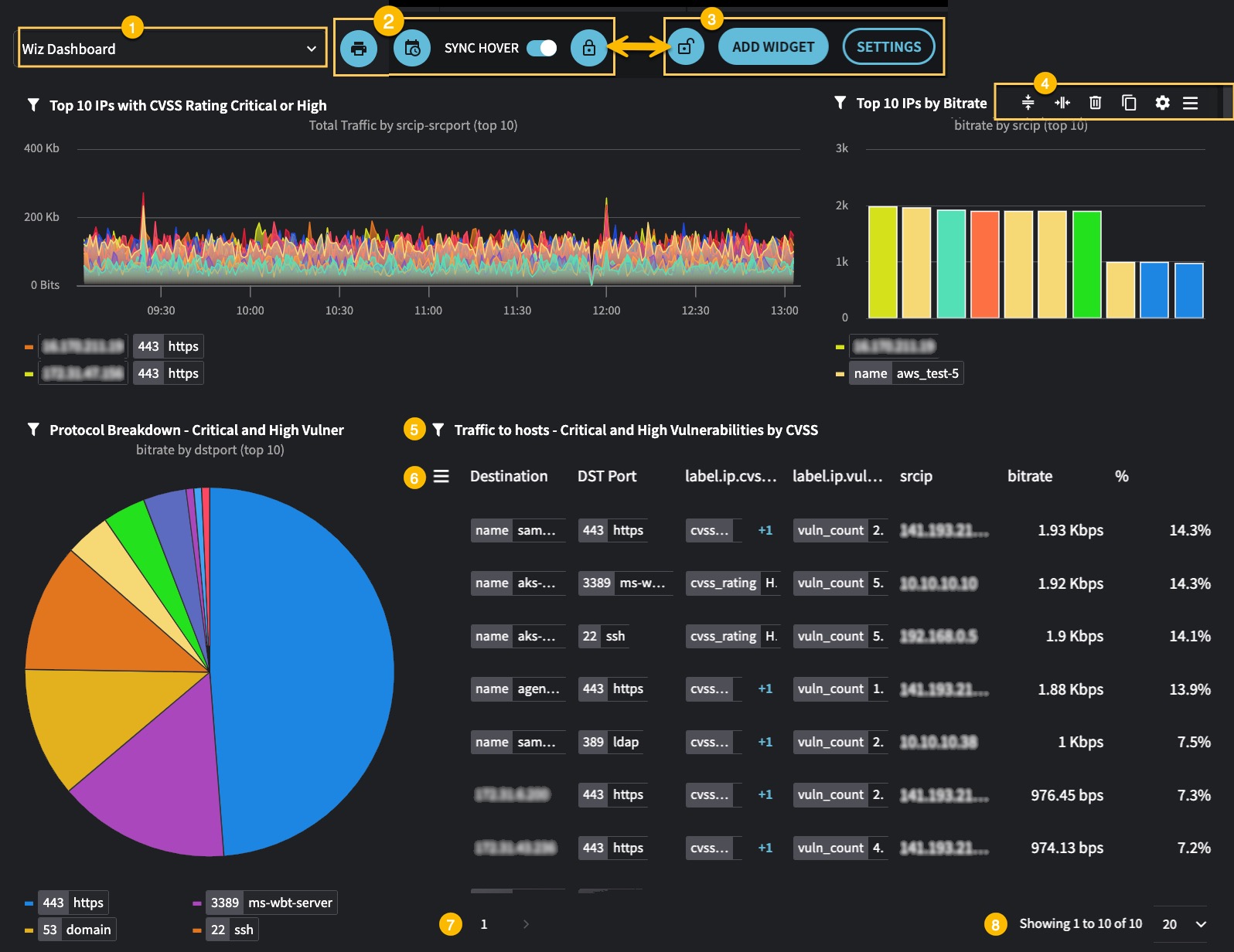
Dashboard pages include elements that impact both the entire dashboard page, widgets, and widget elements.
Getting Here

: Changes made to dashboards in edit mode take effect immediately. There is no SAVE button or UNDO option.
From the main menu
- Navigate to Dashboards > All.
- Click the row options icon at the beginning of the row that includes the dashboard name.
- Click Edit.
From the Dashboard's page
- Open the dashboard page.
- The dashboard becomes editable when you click the lock button . The unlock button displays, indicating the dashboard is in Edit mode.
1,2,3 Entire Dashboard Options
The options and actions below impact the entire dashboard.
| ID | Action | Description |
|---|---|---|
| 1 | Dashboard Dropdown | Use to quickly navigate to different dashboards from a dropdown list. |
| 2 | Prints the current view of the dashboard or widget. | |
| 2 | Schedule | Opens the Schedule configuration page, which allows you to automate the delivery of dashboard data to specified recipients at regular intervals. |
| 2 | Sync Hover | Toggles synchronized hovering across multiple widgets, allowing for cross-widget comparisons. |
| 2 | Locked Dashboard | Dashboards that display Locked dashboards cannot be edited. |
| 3 | Unlocked Dashboard | The unlocked icon indicates the dashboard is editable. |
| 3 | Add Widget | When the dashboard is in edit mode, the Add Widget button displays, allowing you to add a new widget to the dashboard. |
| 3 | Settings | Accesses the settings for the dashboard, allowing you to customize global options and configurations. |
4 Widget Container Options
You can change the layout of the Dashboard by rearranging, moving, or deleting its widgets.
You can also navigate to widget settings and widget menus from the dashboard page.
| Icon | Action | Description |
|---|---|---|
| Equalize Widget Heights | Allows you to equalize the height of all widgets in the row to create visual uniformity. Use this feature if the heights of the widgets are not equal. | |
| Equalize Widget Widths | Allows you to equalize the width of all widgets in the row to create visual uniformity. Use this feature if the width of the widgets are not equal. | |
| Delete Widget | Removes the widget from the dashboard. | |
| Duplicate Widget | Creates a copy of the widget for reuse or further customization. | |
| Widget Settings | Opens the settings for the widget, allowing for customization of its content and appearance. | |
| Widget Context Menu | Accesses additional options or actions for the widget, typically through a dropdown menu. |
Table Widget Options
| Icon | ID | Action | Description |
|---|---|---|---|
| 5 | Stationary Icon | The filter next to the title of a widget indicates you have changed one or more default settings: NQL - Override NQL - Append Date & Time - Custom Metric - any | |
| 6 | Table Context Menu | To view the table context menu, click the hamburger icon (three horizontal lines) . The Table context menu displays options related to the table data, data export, table layouts, column order, and column visibility. The Group By section displays, when a column is grouped in the current table's layout. |
Widget Pagination Options
| ID | Action | Description |
|---|---|---|
| 7 | Page number | Widgets may include multiple pages. Item (7) displays how many pages must be displayed to see all the available data. This number changes based on the dropdown in Item 8. |
| 8 | Number of rows | This area indicates the number of rows of data that are available in the widget. |
Updated about 8 hours ago
